Friday, 4 February 2011

Evaluation Activity 4

How Did You Use New Media Technologies In Research and Planning, Construction and Evaluation Stages?

Research and Planning
Before we started to plan and create our final music video, we had to go through various stages of planning. The first part of our planning was to research the conventions of real music videos. To do this we used the internet- we used YouTube to watch a variety of music videos belonging to different genres of music and picked out the similarities.

After gathering a list of conventions we each did an analysis of a music video of our choice. We used our blog (www.blogger.com) to write a detailed explanation of the music video and the conventions, including the use of images to help illustrate the conventions.

Before we started planning our final video, we first had to create a practice one. This was a quick process, and we didn't spend too long filming or editing this piece. We used Imovie to edit this together. This made us realize how hard it will be to create the our real video, as at first we underestimated the amount of shots we would actually need.
As a group we decided our song choice, we decided that we was going to use ‘Everybody's Changing’ by Keane. We had to find out some information about them to use in our presentation to the class. We used Wikipedia to find the majority of our information.
We also used YouTube to watch some of Keane’s music videos and the current video for our song choice. This helped us to gather information about their usual style choice and how they incorporate performance and narrative into their videos. one of the tasks that the exam board required us to do was to find out record label of our band/ artist and email them asking them permission to use their song- as its copyright. We found out the record label during our previous research on Keane. Using this information i went onto their record labels website (www.fiercepanda.co.uk) and used the contact us page to send the an email.
Once we had designed all of our storyboards on paper we filmed them using a camera. We uploaded this to the computer and edited it using Imovie. This then become an animatic storyboard, this was handy because it allowed us to set a time for each shot and change any is necessary. We also used this during our filming for our final music video, we were able to access this using the internet on our phones.
As part of our coursework we also had to create 2 ancillary products to accommodate our music video. The first of the products was the Digipack, we again researched the conventions of these. To do this we looked at examples and picked out the similarities and differences and created a list. To find some examples we used google images.
we also did this for advert, we used the internet to research the conventions of a music advert and used google images to find an example each which we analyzed. This helped us when creating our final adverts.


Construction
Once we had completed all the research and planning for our music video we could begin the construction. We used google maps to find what locations we should use, and what areas would be most suited.


We used digital technology throughout the entire construction stage, as we were using a digital camera to film our footage. This allowed use to be creative and film a variety of different shots, including extreme close up, long shot, and high angle. Using a digital camera and a tripod allowed us to film certain shots several times, and in different ways, meaning we could always achieve the shot we wanted. During the production stage, we regularly updated our blog to keep track of our filming process, which helped us to improve everytime we had a filming session. Using our blogs also enabled us to refer back to our research into music video conventions and our chosen artist, so we could ensure we were following the conventions and being creative.


Another form of digital technology we used was an iPhone. When we were filming the lip syncing parts of our music video, it was crucial that Daniel was miming in time with song and singing the correct lyrics. So by playing the song from an iPhone we were able to achieve this. Each time we had filmed some of the footage, we uploaded it to a Mac computer, and automatically to the iMovie software. We were then able to edit each clip to the exact duration and order that we wanted, in time to the song. This software helped us alot with our editing, as we had to be very precise with the timing, especially the lip syncing. This took quite a while to match the lip syncing up, but we managed to do it and were very pleased with the end result. The iMovie software also allowed us to add special effects and techniques, so we used this to are advantage. We changed the colouration of the clips to give them a more grey tone, and we used slow motion for 4 shows throughout our music video. It also allowed us flip shots so that they were the other way, which allowed us to achieve better continuity with our video. Another feature that we could do was to speed up or slow down clips, or even to reverse. This enabled our shots to be more fluid together, and also make the timing more precise.


How Did You Use New Media Technologies In The Evaluation?
To evaluate our product we did a combination of digital distribution (for easy access to audience) and interview/analysis of feedback. For digitally distributing our product, we used the apple iMovie software to export our music video into a file. We then uploaded this file to the video-sharing site 'YouTube', providing exposure and opportunity for feedback. We then interviewed several classmates after they had watched the video, asking them questions about how effective certain elements were. To achieve this we used an analogue video camera attached to a tripod, filming their responses onto digital tape. The footage was then manually uploaded onto the apple iMovie software, and cut down for the sake of brevity. Much like the music video, we then exported and uploaded this to youtube, providing us with the means to display the interviews on our blog. Finally, we sat down as a group and analysed the feedback, using the same techniques mentioned previously, and then also uploaded this to youtube and then embedded it to our blog. To create this evaluation of media technologies, we used a digital camera to take pictures of both the hardware and software aspects of our media project, transferring them to the computer via USB cable and then embedding them within this post.

Thursday, 3 February 2011

Evaluation Activity 3

Audience Feedback
Audience feedback given by Gemma Anderson & William Wise


Group Discussion
Us discussing the feedback we were given, weather we agreed we it, and what are thoughts were.

Thursday, 27 January 2011

Evaluation Activity 2

How effective is the combination of your main product and ancillary tasks?

How the digi-pack and advert use the appropriate conventions in terms of style and layout.
Firstly our digi-pack follows the traditional format of a real digi-pack, it is made of 6 panels each of which are the correct length and width. We have divided each one, and using our plans have incorporated ideas, from each into our final design. Half of our design is upside down this is so that when printed and folded it will be correct. We have also laid out the digi-pack in the correct manner, with the CD cover In the right hand bottom corner etc...
A main convention of a digi-pack that we have followed is the band/ artist name included on the front cover of the digi-pack. We have used the same font throughout both our digi-pack and advert to follow a consistent theme and keep it to a professional standard. The main color of our digi-pack is black and this is the reason we have chosen to use a white font for the text to create a stark contrast between them. The stye of our digi-pack is quite dark- which follows the atmosphere/ mood of our music video that we have created which is why there is a link between them. We have used the three block colors on the front cover, as this contrasts with the lack of color within our video. The colors used (green, red and blue) are primary colors which are quite basic.
The back cover and the top left hand corner panel are similar in style, both black with white writing placed on-top. The back cover lists the songs on the album which is another convention of a digi-pack. Almost every digi-pack should include a image of the band/ artist which is why we have added a image of the band Keane, however we have applied various editing techniques to this picture to make it stand out and follow the layout/ theme that we are trying to create. We have also added a picture from our video into the digi-pack as this is also a convention that would be used in real media products.
The actual design of CD is suppose to be an eye, however after editing the picture it seems to be slightly abstract- we decided to keep this because it looks effective and again fits into the theme of our song in that the protagonists goes through a series of events in one day that would trigger a variety of emotions. We have chose an eye to represent these emotions because many emotions can be conveyed through the use of the eye.
Our advert follows the same theme as our digi-pack, however the layout is different as this follows as set of different conventions. We have kept our advert simple, this is so that it is not overcrowded and the audience is not overloaded with information. The band name is dipalyed in large font at the top of the advert ti immediately draw attention to the poster- again we have used white on black to create a contrast. Another convention we have followed is the use of an image, this is an image we have taken from our video and edited in photoshop, affecting the color and design of the image. We have also added a review from NME, after researching real adverts we saw that this convention was always used. In addition to this we have added the release data however challenged this convention slightly by writing ‘OUT NOW’ instead. Finally we have added the record label and a small image of their logo as this is where they are usually displayed on real adverts.
together the digi-pack and the advert work well together and convey a positive image/ message about the band. They work effectively well together along with the video.

Our three media products all share a similar scheme of colour and images to create a solid band identity, one that is easily recognisable and will therefore help to sell music commercially, with consumers able to relate between the advert/music video and album, leading to a purchase. The music video sets the precedence for our products, by enforcing a theme of dreary dullness. This is emphasised with a high contrast, lack of colour (apart from certain concentrations) and heavy shadows. The high contrast is also employed in the magazine advert and digipak. In the advert, the protagonist is displayed, although almost totally white due to the use of exposure/contrast. The same can be said for the digipak, where the front cover uses three different contrasts of silhouettes, the inside front has a very high contrast image of the band, and the back uses an almost identical filter to the music video. The lack of colour is also used in both products, using only a series of coloured blocks in each (both identical for sub-conscious recognition by the consumer). All of these features combine to create a dull, dreary theme that relates directly to the music. It is also very relevant to the theme of the real-life band Keane, which is also insipid, using carefully rationed splashes of colour to keep the audience looking at specific things, although the real band are much more abstract, often favouring abstract drawings and senseless combinations of colours and shapes.


Friday, 21 January 2011

Evaluation Activity 1

In what ways does your media product use, develop or challenge forms and conventions of real music videos?

The Style of the Video:
A very dull and dreary style is enforced throughout the music video, which goes hand in hand with the theme of the music. This style is enforced through the use of other filming elements, which create a dreary overtone and slow pace. At no point does the pace rise, which keeps the style consistent throughout and matches the music. Having a style that harmonises with the song is probably the most common convention of music videos. The style we chose very much relates to the style used in other Keane videos. For example, comparing it with 'Bedshaped' reveals the same dull and dreary negativity, except it is far more abstract in it's narrative. Our video challenges the conventions of Keane music videos in this aspect, as it has a solid narrative that is made obvious through constant character development.

Setting and Location:


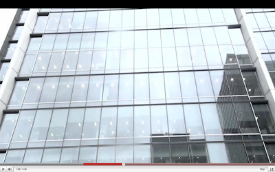
This building was specifically chosen for the 'office-monkey-esque' aura it emits, allowing us to use it as a tool for character development. The idea of shattering normality is a common feature of music videos. A good example would be pendulum's 'Slam' in which a deceivingly average suit-clothed worker strips off his shirt and dances wildly to the song. Other locations were also chosen for the purpose of character development, such as the messy bedroom which is used to introduce the audience to the average lifestyle of the protagonist.

Costumes and Props:

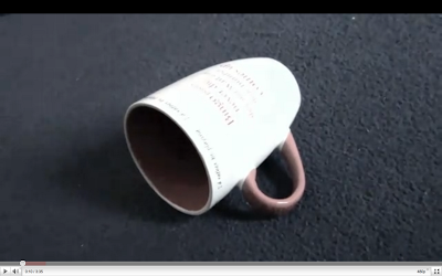
Props was an important part of setting the scene at the beginning of our music video, we used a variety of different props and set the mise- en- scene carefully in order to convey the characters personality/ lifestyle and allow the audience to make their first assumptions about this character. As the video goes on the protagonist further develops and the audience becomes aware the he is a sloppy, careless character. We used the mug on the floor, the full bin, clothes on the floor and the plate with leftover food to portray this. We have challenged Keane’s usual use of props as in their music video ‘Everybody’s changing’ there is a limited use of props and the main props used are the music instruments. The video follows an abstract narrative and therefore the props used have no particular meaning to the audience.

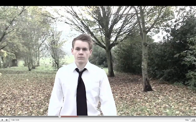
We chose to dress our protagonist in a suit to represent the type of job he does for a living and the location of his workplace. We used a purple tie as this colour represents his emotions/ feelings perfectly. He is not happy with his life, and is on the verge of depression. We dressed the ‘mugger’ in dark clothing and more importantly a hooded jacket as this is a generic stereotype of this type of person and allows the audience to recognize this immediately. Music videos usually dress their characters according to the narrative and performance of the video, therefore we have followed this convention.

Camerawork:
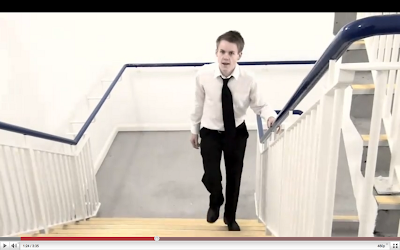
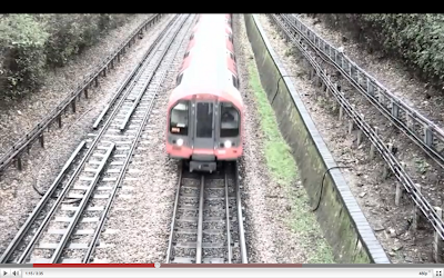
In our music video we have used a variety of different shots, including; tracking shots, high angle shots, low angle shots and medium to long shots. Here are some example to illustrate this.


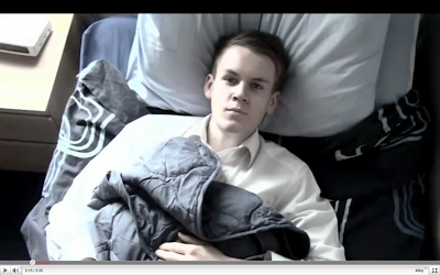
Including a variety of shots has allowed us to be creative in the making of our video. At the beginning of the video we have used 4 close-up shots showing items within his room, to convey his personality and illustrate his lifestyle. We have also used an ariel shot when he is laying in bed to show the lack of emotions in his face ad how this relates to the shots previously (lifestyle). When lip syncing has been used we have used close-up and extreme close-up shots, so that the focus is on the characters face/ mouth. For the chorus of the song, we have used a tracking shot which allowed us to change the background as planned. Filming this part was the hardest as we had to use the same shot roughly 15 times changing the location. It was also important that we started the tracking shot from the same distance each time to make it look consistent and professional. We have followed the convention of using a variety of different shots each time to convey a different mood/ setting. As the beat of our song is quite slow, we didn’t need to use as many shots as a normal upbeat music video would use.
Finally we have set the length of each clip, to fit in with the beat of the song as well as keep the video flowing and keeping the audience entertained. An example would be at the start of our video we have used four, one second shots. Although these shots are important, they are not required to be any longer otherwise the audience would get bored.

Editing:
We have used editing consistently throughout our video, from previous research we know that the shots that include lip- syncing must be edited in time with the music so that the lip syncing looks consistent and looks professional. We have used lip syncing in various shots within our video, and have successfully edited in time with the music. It was difficult to do this as we decided to change some of the timings that we originally agreed on, this meant that parts of the lip syncing was out of sync.
As well as this we have used slow motion twice in our video, when the spoon is falling and when the character gets pushed over.


Special Effects/Techniques:
One of the main aspects of our music video is the changing effect of the background. We had the protagonist continuously walking during the chorus, but the background was changing to different locations each time. We used this technique to relate to the theme of the song, and to break up the chorus from the verse. To make this technique effective and successful, we had to ensure we used a variety of locations, including a forest, alleyway, street etc. When filming each shot, it was important that each one was at the same angle and distance, to make it look professional and to show the effect of just the background changing. During the editing of these clips, we cut each shot to the beat of the song so they changed in time with the music. This kind of effect isn't usually used in music videos, so we decided to add it, as we thought it made are video more original; and wanted to challenge the typical conventions. Keane's music video's are usually quite abstract, which I feel we captured in our video, but we didn't focus so much on performance, which Keane did in the official video for 'Everybody's Changing'.


We didn't really use any special effects in our music video, as this would have been quite difficult and we wanted to focus on the narrative of our music video. However, we did use a filter on the clips to make the colouring slightly darker, which added to the mood and atmosphere of our video. This successfully reflected the emotions of the male protagonist, to make the audience more intrigued. This special effect we used develops the typical forms and conventions of Keane's music videos, because they are usually quite dark and sombre, and not bright and colourful. This shot shows how we altered the saturation to create a black and white effect, to emphasise the tedious atmosphere.


Performance
Performance is one of the main conventions that is used in music videos. To develop this convention, we decided to incorporate this into our music video. We didn't continuously use performance throughout the entire video, as we didn't want to distract the audience from the narrative and storyline. As a group we thought it would be best to have the character lip syncing to the song, rather than another person portraying the artist; because we wanted to have the protagonist tell the story so the audience could relate to it more. To be creative with the performance of our music video, we incorporated the lip syncing into the plot, so the character was carrying on with their everyday tasks, drink a cup of coffee for example which can be seen in the shot below, whilst still lip syncing to the song. Performance makes up a very large proportion of music videos and is nearly always used throughout a song, in order to promote the artist. Keane often rely on performance in their music videos, as this can be seen in the videos for 'Perfect Symmetry' and 'Somewhere Only We Know', so as a group we decided to be original and challenge this convention, whilst still capturing the element of Keane's music videos.


How Does The Video Suggest The Music Genre of The Track?
From our research into Keane, we found that their genre of music is classified as alternative rock, and tends to quite mellow as they use a piano as the lead instrument. 'Everybodys Changing' isn't particularly upbeat so to reflect this we made the character quite depressed and emotionless, by having them show no expression and using a black and white costume. The beat and style of the song is fairly abstract, and our video suggests this as we used the background changing effect and slow motion. Both of these elements aren't that common in music videos, so by including them, it shows the abstract and alternative aspect to the song.


How Does Your Video Reflect Research Done Into The Style Of The Artist's Other Videos?
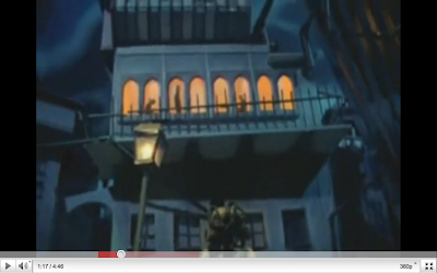
From our research into Keane, we found that their genre of music is classified as alternative rock, and tends to be mellow as they normally use a piano as the lead instrument. Some of Keanes music videos are quite abstract, in particular 'Bedshaped' and 'Is It Any Wonder?'. We found that the video for 'Bedshaped' helped us to scope our idea, because the video follows a narrative and tells a story, but it doesnt it in an unconventional way, as seen below, which is want we wanted to achieve. We feel that our video reflects this, because the narrative can be clearly identified by the audience, and we incorporated creative techniques such as slow motion, and the background changing effect to make it more abstract. From our research into Keane, we found that they use some sort of performance in every music video (to the best of our knowledge). This helped us to decide that we should develop this convention, and reflect the style of Keane, by using performance in our music video as well. However we just used a singular character to do the lip syncing and performance, rather than an actual band performing.

Wednesday, 19 January 2011

Conventions of a Magazine Advert

Another part of the ancillary task was to create a magazine advert for our music video, that captured the idea and meaning behind our video. We had to complete research to find out what the conventions of a magazine album advert are.

- name of artist
- name of album/digipak
- release date
- images of the artist
- images from the music video
- artists website
- MySpace address
- relevant visual images
- reviews
- record label
- music store logo (eg. HMV)

Here are some examples of magazine album adverts:

Magazine example analysis

I have decided to analyze another magazine advert as this will help with our research and help us when creating our magazine advert.
This is a advert for the ‘The Best Of The Vines’.

Firstly the advert is made using a white background and has many images placed on-top, the images added looks effective as they have been made using a bright green color which contrasts against the white background.
Secondly the name of the artist/ band has been included, the name has been incorporated into one of the green image, it blends in well and looks as if it is part of the image.
the advert is quite abstract, however this may well be the theme of this particular band/ artist, for their fans this theme may be immediately recognizable.
Another convention of a magazine advert advertising a CD is the date of which the CD is released, however in this case ‘OUT NOW’ has been added as the CD has already been released.
Some basic information about what is included on the CD has also been added to allow the audience to make a decision on whether they want the CD or not. ‘Plus exclusive bonus track, 4EVA’ has been included this is to persuade the audience and allow them to think they are getting something for free.
Finally information about how the audience can purchase the CD is included and a small logo of the band/ artists record label has been added right at then end.

By Rebecca Gomes