In what ways does your media product use, develop or challenge forms and conventions of real music videos?
The Style of the Video: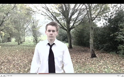
A very dull and dreary style is enforced throughout the music video, which goes hand in hand with the theme of the music. This style is enforced through the use of other filming elements, which create a dreary overtone and slow pace. At no point does the pace rise, which keeps the style consistent throughout and matches the music. Having a style that harmonises with the song is probably the most common convention of music videos. The style we chose very much relates to the style used in other Keane videos. For example, comparing it with 'Bedshaped' reveals the same dull and dreary negativity, except it is far more abstract in it's narrative. Our video challenges the conventions of Keane music videos in this aspect, as it has a solid narrative that is made obvious through constant character development.
Setting and Location: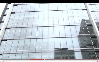
This building was specifically chosen for the 'office-monkey-esque' aura it emits, allowing us to use it as a tool for character development. The idea of shattering normality is a common feature of music videos. A good example would be pendulum's 'Slam' in which a deceivingly average suit-clothed worker strips off his shirt and dances wildly to the song. Other locations were also chosen for the purpose of character development, such as the messy bedroom which is used to introduce the audience to the average lifestyle of the protagonist.
Costumes and Props: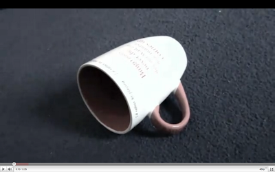
Props was an important part of setting the scene at the beginning of our music video, we used a variety of different props and set the mise- en- scene carefully in order to convey the characters personality/ lifestyle and allow the audience to make their first assumptions about this character. As the video goes on the protagonist further develops and the audience becomes aware the he is a sloppy, careless character. We used the mug on the floor, the full bin, clothes on the floor and the plate with leftover food to portray this. We have challenged Keane’s usual use of props as in their music video ‘Everybody’s changing’ there is a limited use of props and the main props used are the music instruments. The video follows an abstract narrative and therefore the props used have no particular meaning to the audience.
We chose to dress our protagonist in a suit to represent the type of job he does for a living and the location of his workplace. We used a purple tie as this colour represents his emotions/ feelings perfectly. He is not happy with his life, and is on the verge of depression. We dressed the ‘mugger’ in dark clothing and more importantly a hooded jacket as this is a generic stereotype of this type of person and allows the audience to recognize this immediately. Music videos usually dress their characters according to the narrative and performance of the video, therefore we have followed this convention.
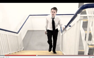
Camerawork:In our music video we have used a variety of different shots, including; tracking shots, high angle shots, low angle shots and medium to long shots. Here are some example to illustrate this.
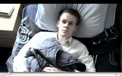
Including a variety of shots has allowed us to be creative in the making of our video. At the beginning of the video we have used 4 close-up shots showing items within his room, to convey his personality and illustrate his lifestyle. We have also used an ariel shot when he is laying in bed to show the lack of emotions in his face ad how this relates to the shots previously (lifestyle). When lip syncing has been used we have used close-up and extreme close-up shots, so that the focus is on the characters face/ mouth. For the chorus of the song, we have used a tracking shot which allowed us to change the background as planned. Filming this part was the hardest as we had to use the same shot roughly 15 times changing the location. It was also important that we started the tracking shot from the same distance each time to make it look consistent and professional. We have followed the convention of using a variety of different shots each time to convey a different mood/ setting. As the beat of our song is quite slow, we didn’t need to use as many shots as a normal upbeat music video would use.
Finally we have set the length of each clip, to fit in with the beat of the song as well as keep the video flowing and keeping the audience entertained. An example would be at the start of our video we have used four, one second shots. Although these shots are important, they are not required to be any longer otherwise the audience would get bored.
Editing:We have used editing consistently throughout our video, from previous research we know that the shots that include lip- syncing must be edited in time with the music so that the lip syncing looks consistent and looks professional. We have used lip syncing in various shots within our video, and have successfully edited in time with the music. It was difficult to do this as we decided to change some of the timings that we originally agreed on, this meant that parts of the lip syncing was out of sync.
As well as this we have used slow motion twice in our video, when the spoon is falling and when the character gets pushed over.
Special Effects/Techniques:One of the main aspects of our music video is the changing effect of the background. We had the protagonist continuously walking during the chorus, but the background was changing to different locations each time. We used this technique to relate to the theme of the song, and to break up the chorus from the verse. To make this technique effective and successful, we had to ensure we used a variety of locations, including a forest, alleyway, street etc. When filming each shot, it was important that each one was at the same angle and distance, to make it look professional and to show the effect of just the background changing. During the editing of these clips, we cut each shot to the beat of the song so they changed in time with the music. This kind of effect isn't usually used in music videos, so we decided to add it, as we thought it made are video more original; and wanted to challenge the typical conventions. Keane's music video's are usually quite abstract, which I feel we captured in our video, but we didn't focus so much on performance, which Keane did in the official video for 'Everybody's Changing'.
We didn't really use any special effects in our music video, as this would have been quite difficult and we wanted to focus on the narrative of our music video. However, we did use a filter on the clips to make the colouring slightly darker, which added to the mood and atmosphere of our video. This successfully reflected the emotions of the male protagonist, to make the audience more intrigued. This special effect we used develops the typical forms and conventions of Keane's music videos, because they are usually quite dark and sombre, and not bright and colourful. This shot shows how we altered the saturation to create a black and white effect, to emphasise the tedious atmosphere.
 Performance
Performance is one of the main conventions that is used in music videos. To develop this convention, we decided to incorporate this into our music video. We didn't continuously use performance throughout the entire video, as we didn't want to distract the audience from the narrative and storyline. As a group we thought it would be best to have the character lip syncing to the song, rather than another person portraying the artist; because we wanted to have the protagonist tell the story so the audience could relate to it more. To be creative with the performance of our music video, we incorporated the lip syncing into the plot, so the character was carrying on with their everyday tasks, drink a cup of coffee for example which can be seen in the shot below, whilst still lip syncing to the song. Performance makes up a very large proportion of music videos and is nearly always used throughout a song, in order to promote the artist. Keane often rely on performance in their music videos, as this can be seen in the videos for 'Perfect Symmetry' and 'Somewhere Only We Know', so as a group we decided to be original and challenge this convention, whilst still capturing the element of Keane's music videos.
 How Does The Video Suggest The Music Genre of The Track?
From our research into Keane, we found that their genre of music is classified as alternative rock, and tends to quite mellow as they use a piano as the lead instrument. 'Everybodys Changing' isn't particularly upbeat so to reflect this we made the character quite depressed and emotionless, by having them show no expression and using a black and white costume. The beat and style of the song is fairly abstract, and our video suggests this as we used the background changing effect and slow motion. Both of these elements aren't that common in music videos, so by including them, it shows the abstract and alternative aspect to the song.
 How Does Your Video Reflect Research Done Into The Style Of The Artist's Other Videos?
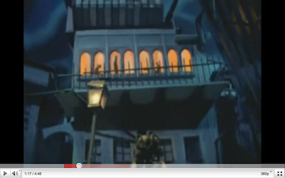
From our research into Keane, we found that their genre of music is classified as alternative rock, and tends to be mellow as they normally use a piano as the lead instrument. Some of Keanes music videos are quite abstract, in particular 'Bedshaped' and 'Is It Any Wonder?'. We found that the video for 'Bedshaped' helped us to scope our idea, because the video follows a narrative and tells a story, but it doesnt it in an unconventional way, as seen below, which is want we wanted to achieve. We feel that our video reflects this, because the narrative can be clearly identified by the audience, and we incorporated creative techniques such as slow motion, and the background changing effect to make it more abstract. From our research into Keane, we found that they use some sort of performance in every music video (to the best of our knowledge). This helped us to decide that we should develop this convention, and reflect the style of Keane, by using performance in our music video as well. However we just used a singular character to do the lip syncing and performance, rather than an actual band performing.


